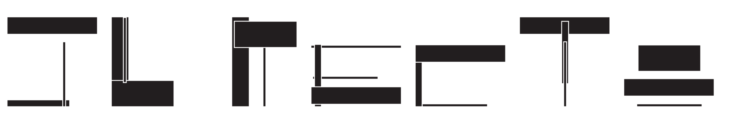
SL Recto
Oct.2019 // Poplar, Spraypaint.
Beginning as a sculptural study in rectilinearity, grid, proportionality, and composition, eventually SL Recto was born. An experimental typeface designed within the constraints of the dimensions and relationships of the volumes in the study, SL Recto pushes the letterform to its extreme and, given the strict constraints, focuses on the most distinct elements of each character.


SL Recto began with a number of studies around rectilinear form, culminating in one finished sculpture. Given the proportions of the final study, each letterform was crafted and tweaked.